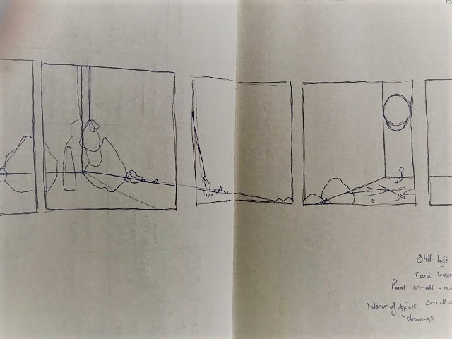
Really useful tutorial. We discussed everything focusing on my painting as I felt that this was most likely going to be the development I plan to exhibit. The following notes are very rough. There is a generally better understanding for me now in terms of how everything sits together as well as a few areas to further explore.
Tutorial notes
The odd selection of item doesn’t fit together under a common heading other than your memories, that you are the connection. A quality which sets them apart in categories. Variety – association with you, time, material doesn’t connect. This is interesting.
The archiving and listing is another set of information which could be infinite. There’s no edge, you could invent multiple elements to the grid. In the same way that a painting selects from aspects of the object its form, light and shade etc. equivalence, clay same dimensions or weight. A material that is related, set up in parallel- kinds of equivalence and substitution. The clay is comparative in weight. Metals fabric may bring out other qualities. Areas of investigation which pull out aspects of exploring the objects
Scale; why large. Or specific metre square, its not huge its still portable, manageable, set of objects are handheld. Thinking about making a painting which is opposite. Maybe a painting where the object is bigger than the support. Question of scale. What’s happening. Small object has isolation in the ambiguous space which it sits in.. Scale which is relatable. Sketches are in ambiguous space as you have for a while. Not certain like Morandi. They are in a neutral space. Attention is being given but they are not contextualized by giving them a space to sit in. I wonder if this is necessary. Surface background wall? Light and shade is about form but not an accurate depiction of window and so on. To understand form but not a precise image. None of this is right or wrong, just an understanding. What is important? Dimensionality. Sense of a corner shelf may be added in /tested and then removed. Does it shift them? Lisa Milroy 80s shoes. Look at this painterly/shadow but lines of shoes which are loosely painted on flat white background. Making no reference to the tradition of still life. Neutral.

Parallel project which is the book/archive and the painting. Could this be something else. A card system index/ material in the publication as an aside. As a way of having, it a form which can be brought in a different was. Scanning and layering. Include artist statement but the physicality of the object. Different cards and qualities of card and paper. Which is how its looking now. The physical object is made of materials which produce different responses in the viewer.? use digital and screen-printing facilities in Uni. The handmade. This gives a lively tactile response. Highlighting the variety of different objects.
Still life reference, ancient Greece, roman mosaics. Presenting a group of things which are the same dimension as the original object in a way which landscape painting cannot do. Still life is considered historically as a low value artform. In the gallery space the objects will lose the thing that the object holds for you. So they will engage with similar things as they may have experienced, painting as an object and also still life painting as a tradition. Is this to be acknowledged. Its part of the paintings background…it’s a positive/exciting because it is painting about painting like the landscapes (materials/painting specific) objects/memories but also still life.
Groups and solo objects. Portraits of objects. Questions about memory are there, implicit in the encounter. Titles / statement could be given if needed. Ideas to include the teeth.
Ways of getting information. My idea to wrap/print/compress. Whiteread. Clay weight. Drawing the insides. The hollow spaces within. This would bypass the oddness of the objects being placed together.

Recent Comments